01
Make a mark
Explored the symbolism of growth and opportunity to give the name Orchard a clear visual point of view.
A brand identity and web design concept for a recruitment and learning platform helping designers grow their skills, find opportunities, and understand what employers need.
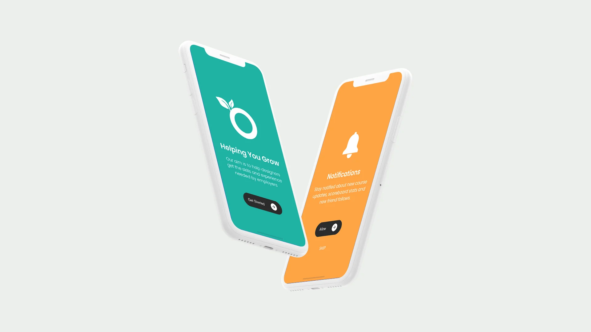
Orchard Recruiting needed a clear identity that could work across a jobs platform, learning content, and practical brand applications. The concept had to feel optimistic, useful, and easy to extend.
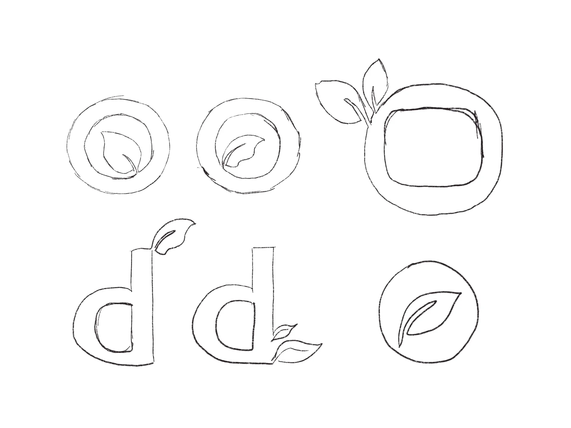
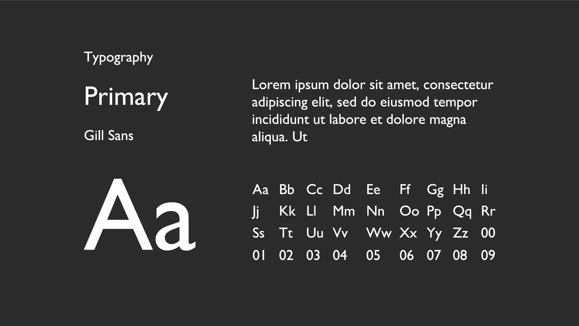
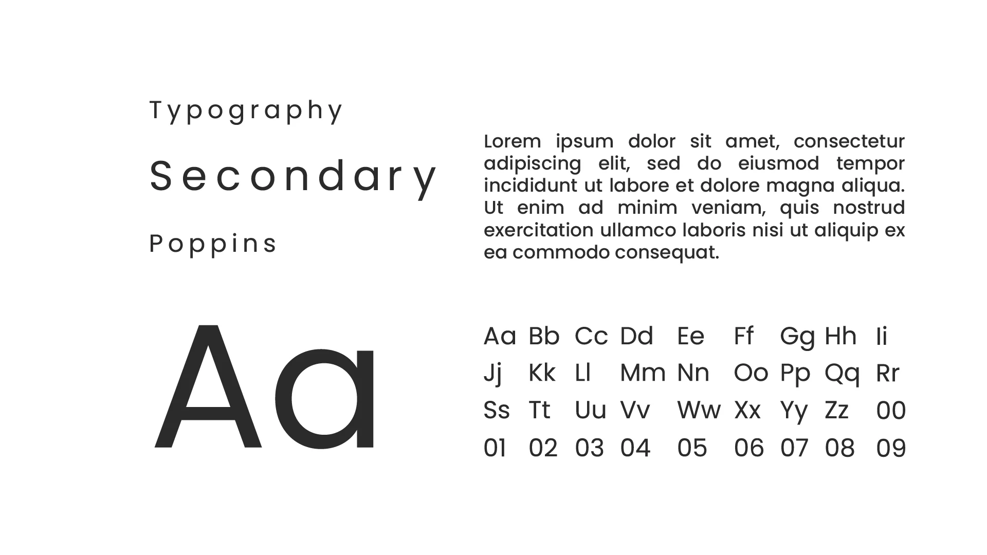
I explored the Orchard identity through logo sketches and typography. The studies below show the mark taking shape and the type choices that supported the recruitment and learning platform concept.
I explored how the Orchard mark could come to life through animation, carrying its fruit-and-leaf shapes into a moving identity. The short loop and longer export show the motion work alongside a screen recording of the design process.
This screen recording opens up the working process behind the identity, adding context to the sketches and finished logo.
Explored the symbolism of growth and opportunity to give the name Orchard a clear visual point of view.
Developed a flexible identity that could support both career opportunities and learning content.
Applied the direction across web, print, and promotional touchpoints so the idea could travel.