01 / Recognition
Keep the product in view
The brief asked for awareness among people new to Kendamil. The packaging and wordmark anchor the designs, while blue, cream and the supplied typography give the formats a shared identity.
From farm to family, made for the feed. Three creative approaches to Kendamil’s “Wholesome” brand world, supported by interactive explorations of its colour and typography.
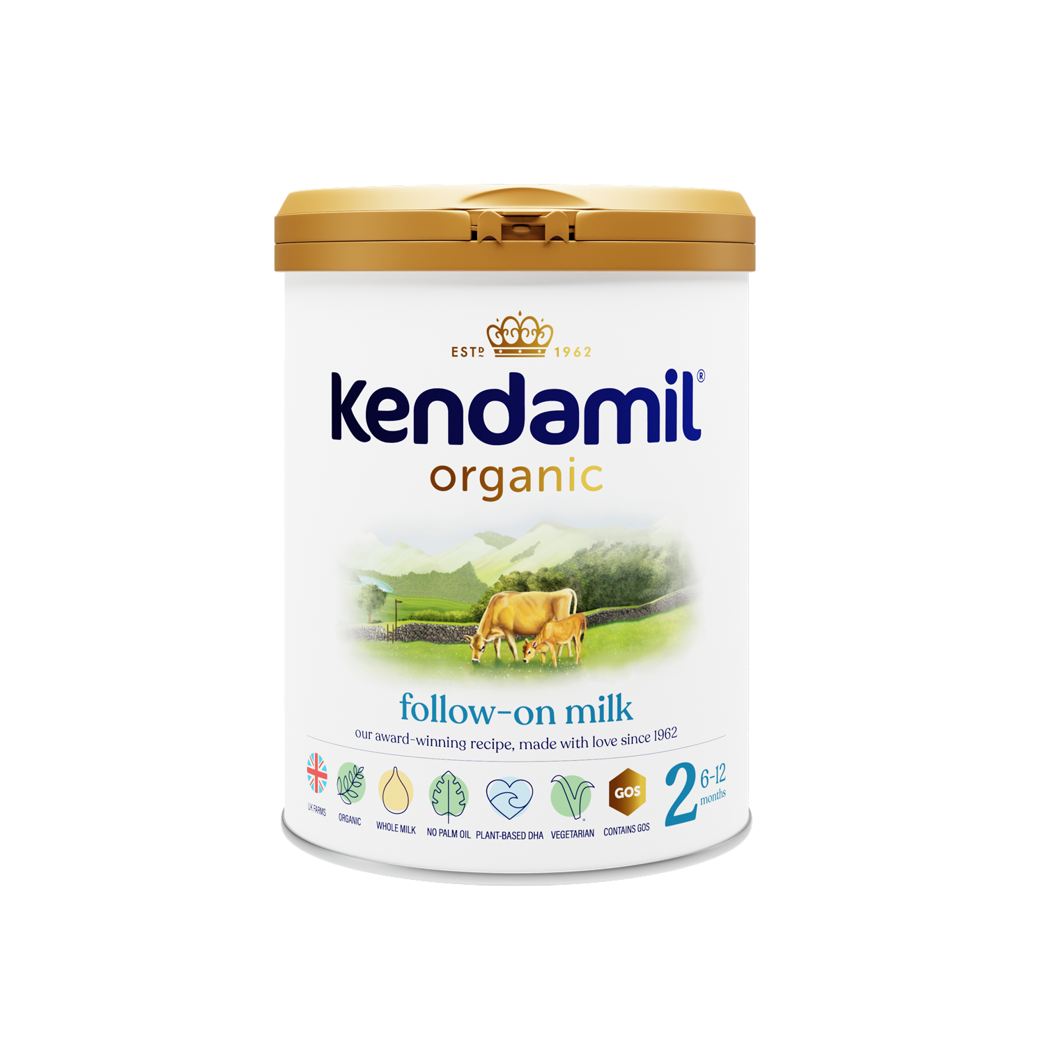
Create three UK Meta paid-social executions for Organic Follow-on Milk, Stage 2, for babies over six months. The task was to attract attention, introduce Kendamil to people unfamiliar with the brand, and make the product recognisable within its refreshed “Wholesome” identity.
I translated the brief into three ideas: “What’s NOT in it” uses ingredient transparency as a bold first message; “From Farm to Family” builds a story across five carousel frames; and “The Wholesome Difference” explores a sensory opening for a short reel. Created for a design interview, the work demonstrates my creative approach rather than campaign results.
Read the original brief ↗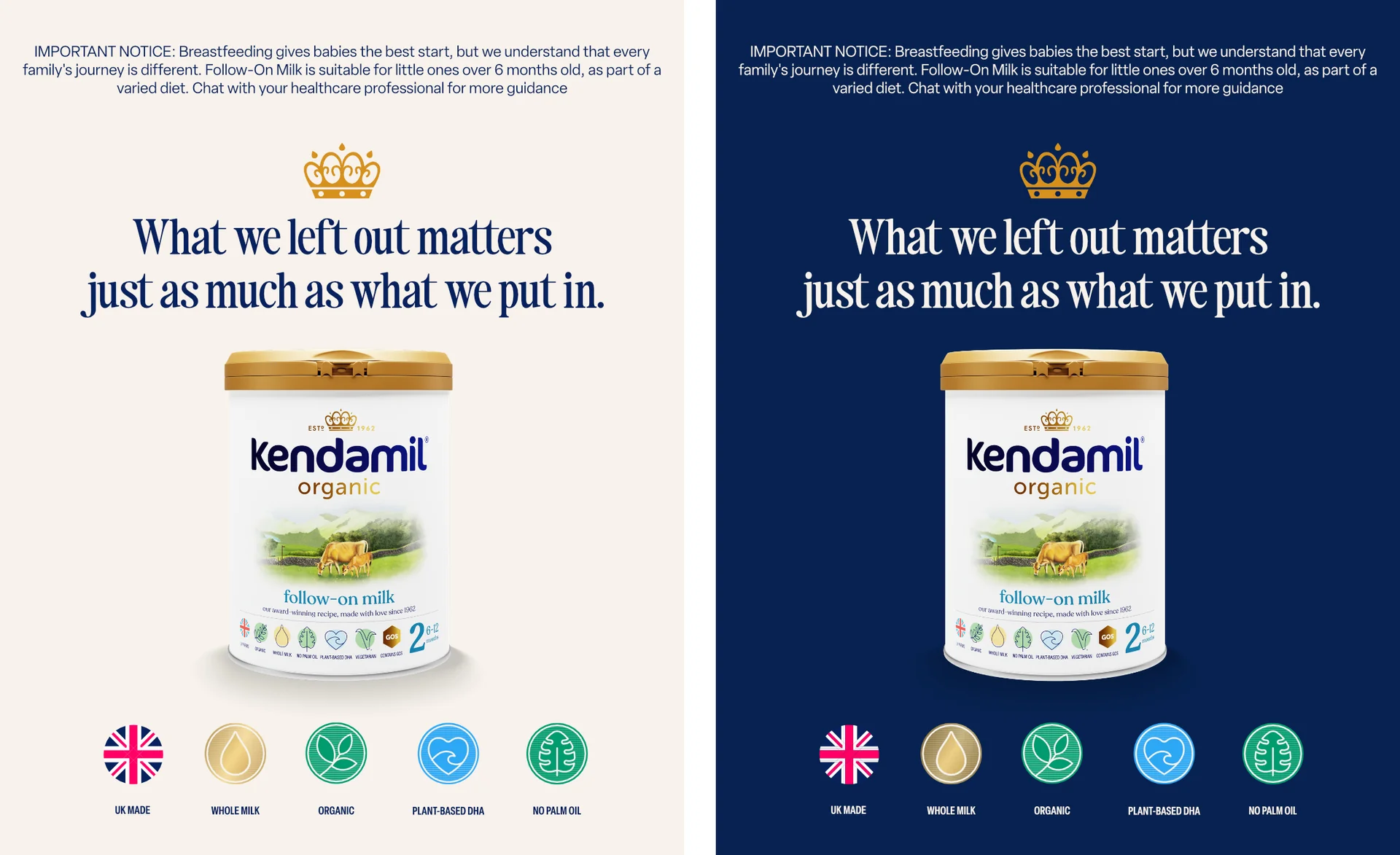
The static concept leads with ingredient transparency. Blue and cream versions put the pack shot and headline first, with supporting icons beneath.
For parents encountering the brand in a busy feed, I wanted one clear thought to land first. A text-led composition, a prominent Stage 2 pack and restrained supporting icons keep the message easy to scan.
Open the artwork ↗
Five frames connect the pasture, whole milk, Lake District provenance, family life and the product. The sequence uses the swipe to reveal one idea at a time, turning the brand line into a visual journey.
Start with the source: a farm setting introduces the brand line.
See the complete sequence ↗The supplied reel explores the opening whole-milk message through motion and type. The presentation proposes a longer sequence moving from a milk pour to provenance, family life and the product.
The planned 18-second sequence moves from a milk pour (0–2s), through kinetic type (2–5s), provenance (5–8s) and a family moment (8–12s), to a product-led finish (12–18s). The exported study shown here explores the opening; the deck sets out the full direction.
Open the reel ↗Alongside the campaign assets, I built a mini interactive guide to Kendamil’s brand world. Explore the colour tokens, switch between packaging and provenance imagery, and adjust the typography to see the system in use. A separate palette study explores further colour combinations.
Choose a showcase above to explore the original interactive build.
The brief asked for awareness among people new to Kendamil. The packaging and wordmark anchor the designs, while blue, cream and the supplied typography give the formats a shared identity.
The static leads with a single message. The carousel unfolds the provenance story. Motion explores a sensory opening and typography that can carry the message without sound.
The interactive showcases extend the work into the browser, letting someone try the palette, compare imagery and adjust a type specimen.
The five-page deck brings together the brief, the creative rationale, the three executions and the proposed motion sequence.
View presentation ↗