01 / On the pack
Make the choice legible
Colour, meal photography and recipe names create a reading order that works across the Prepped Pots range.
Packaging, websites, social campaigns and email marketing for MuscleFood. My in-house role brought design and development together across the customer journey, from discovering an offer to choosing a meal.
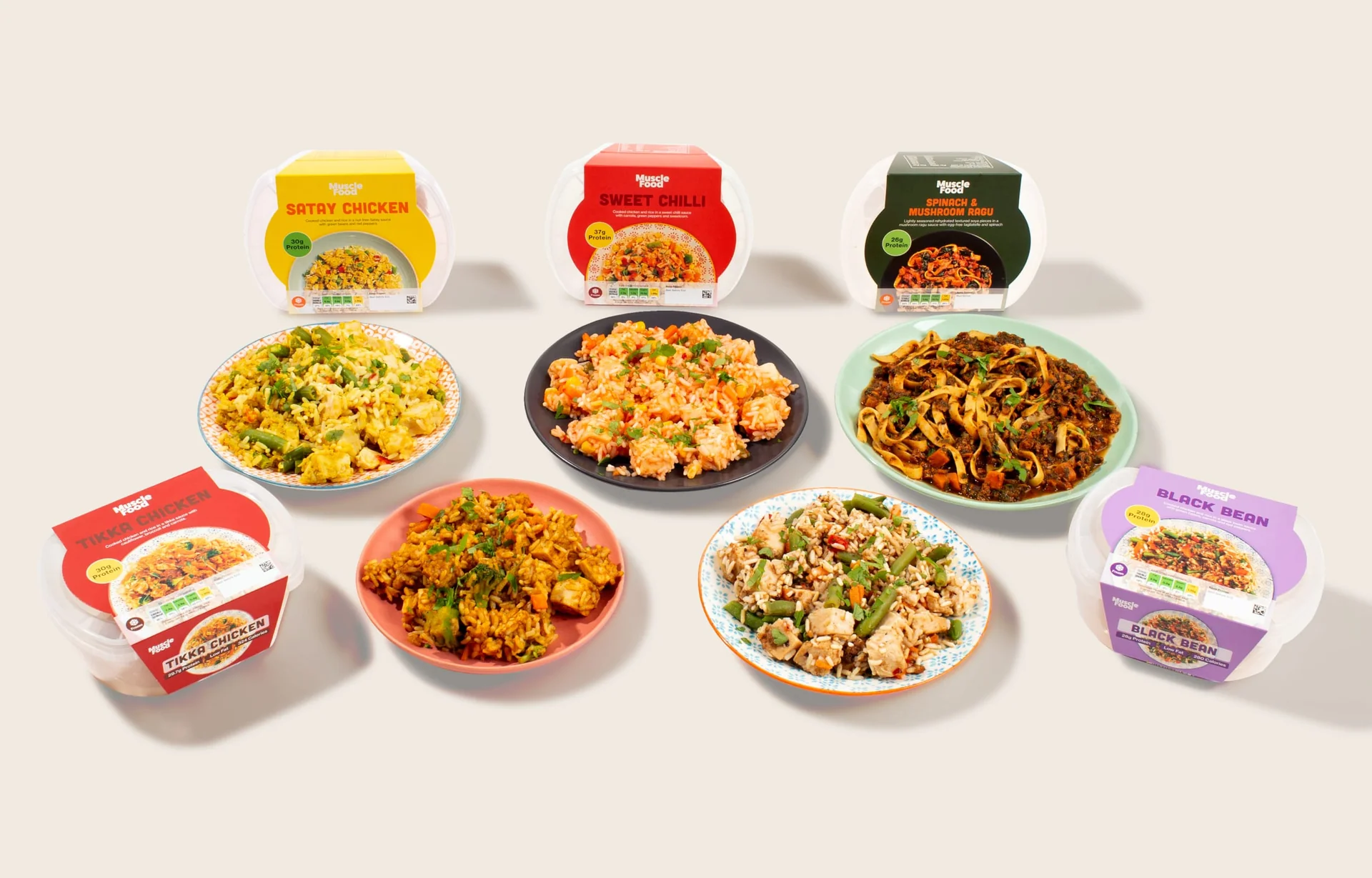
I worked across packaging, website design and development, social media, email marketing, retail graphics and advertising. That meant moving between detailed product information, promotional layouts and short animations, while keeping the food and the offer easy to understand.
Let the food lead. Use colour to distinguish the range, clear hierarchy to make each offer readable, and motion where it adds a useful moment of attention.
Prepped Pots moved from dark, protein-led labels to a brighter, meal-led range. Colour gives each recipe a distinct place in the family, while food photography and a consistent name position keep the range connected.
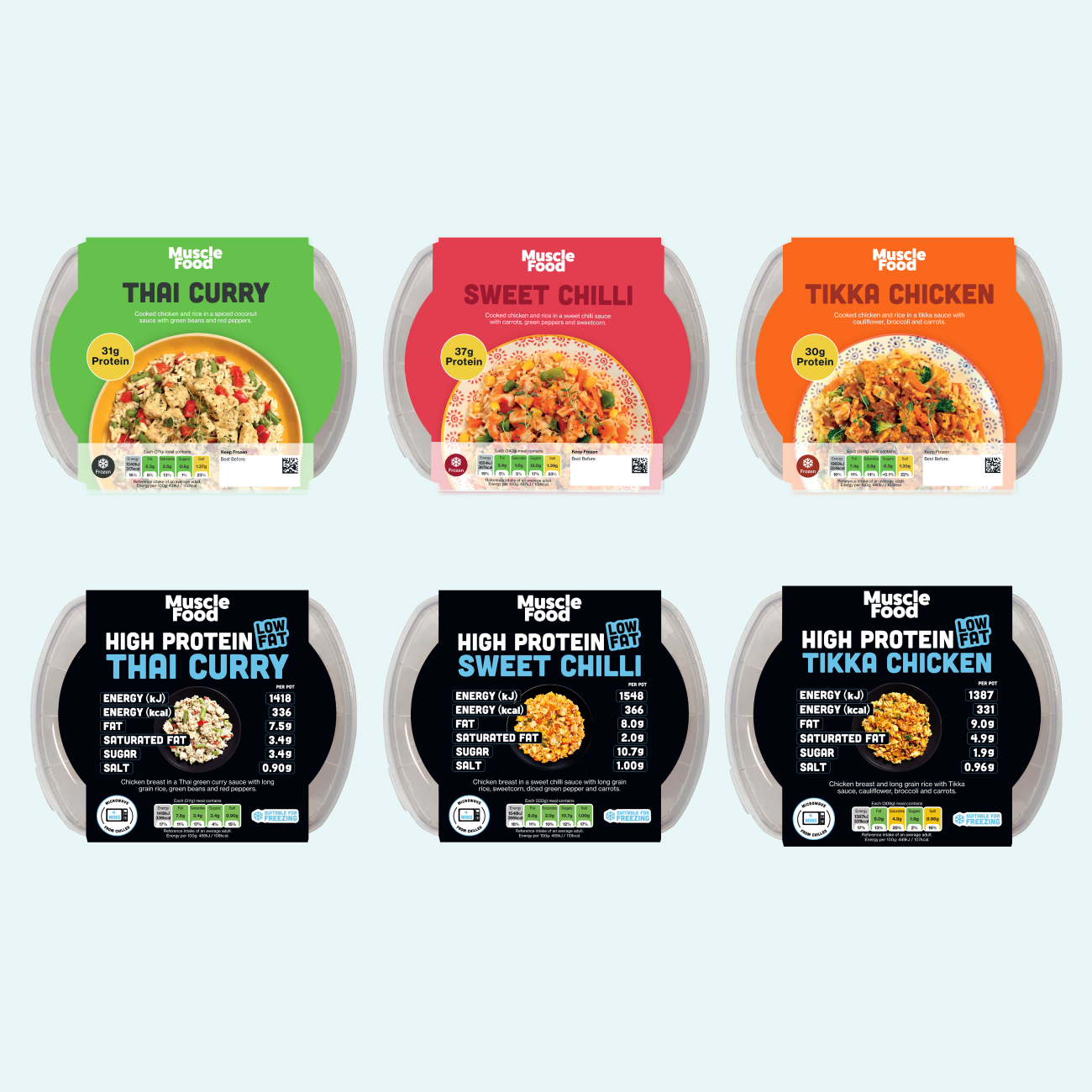
The comparison shows the change in emphasis: larger meal photography, bolder recipe colours and a cleaner reading order. The nutritional message remains part of the pack, with more room for the meal itself.
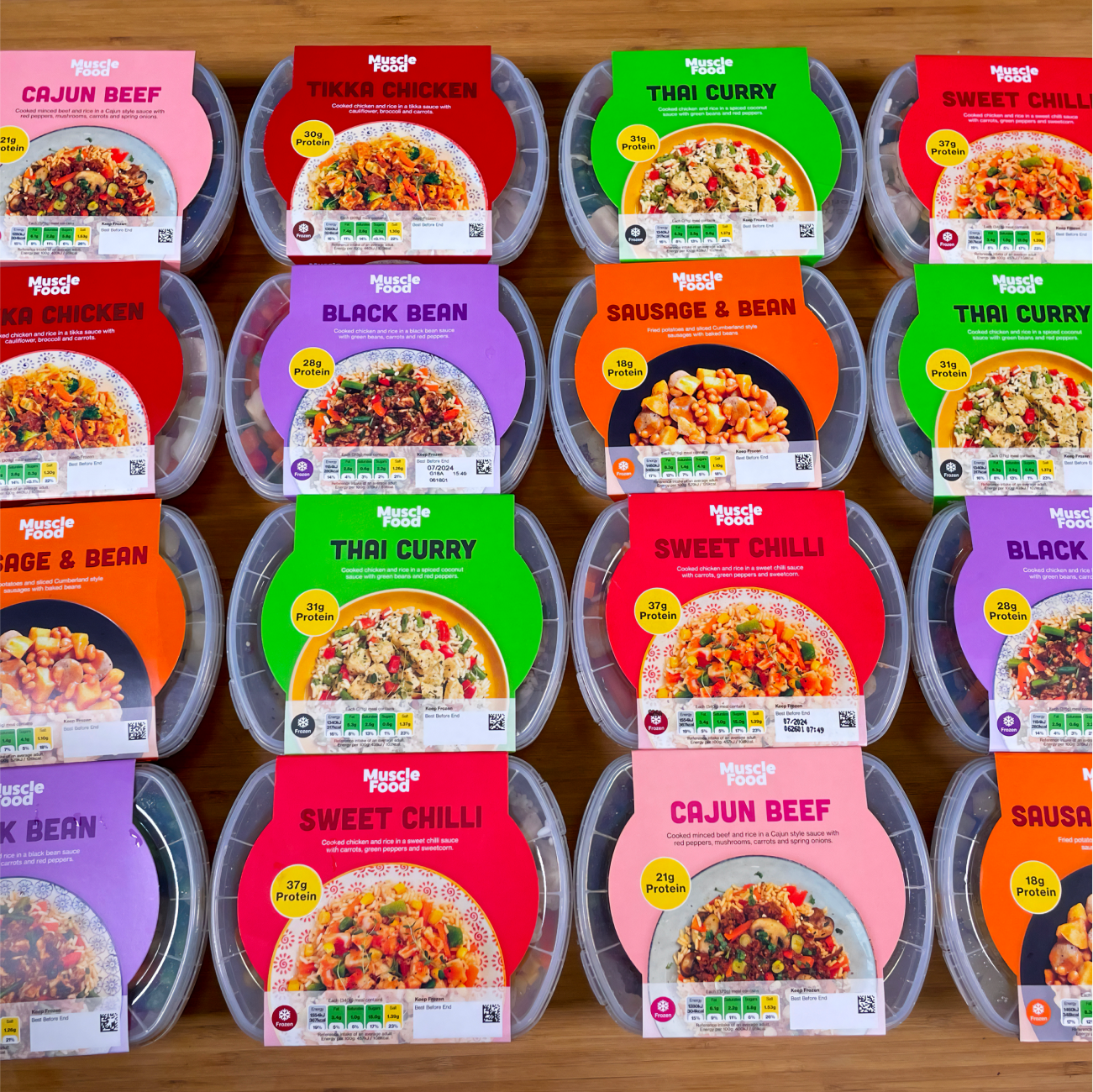
Seen together, the packs show how a shared layout holds a varied range together. Recipe colours create variety, while the wordmark, meal image and information stay in familiar positions.
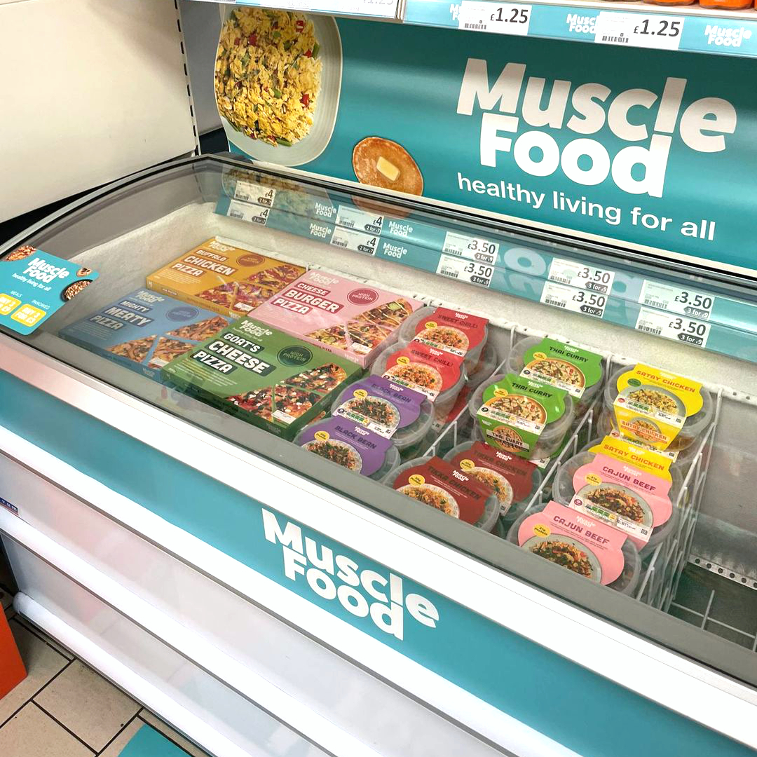
The Heron work extends beyond individual packs. Freezer imagery and sticker graphics give the range a visible home in store, using large branding and food imagery to connect the products on display.
The photograph shows the design in context: customers encounter the freezer surround first, then the colour and detail of the individual packs.
I designed and developed website content for MuscleFood, translating promotional ideas into layouts and working digital assets. My role covered both how a message looked and how it behaved in the browser: arranging product imagery, headlines and calls to action, then adapting the creative to the space available.
The interactive banner below is one surviving example of that work. It combines Lottie animation with JavaScript and shows how I brought motion into a web placement. The wide and compact previews let you explore the same creative at different sizes.
Try the coded banner ↓The Prepped Pots advert carries the product story into motion, showing the meals alongside their packaging. It sits within a wider mix of advertising, product imagery and digital content.
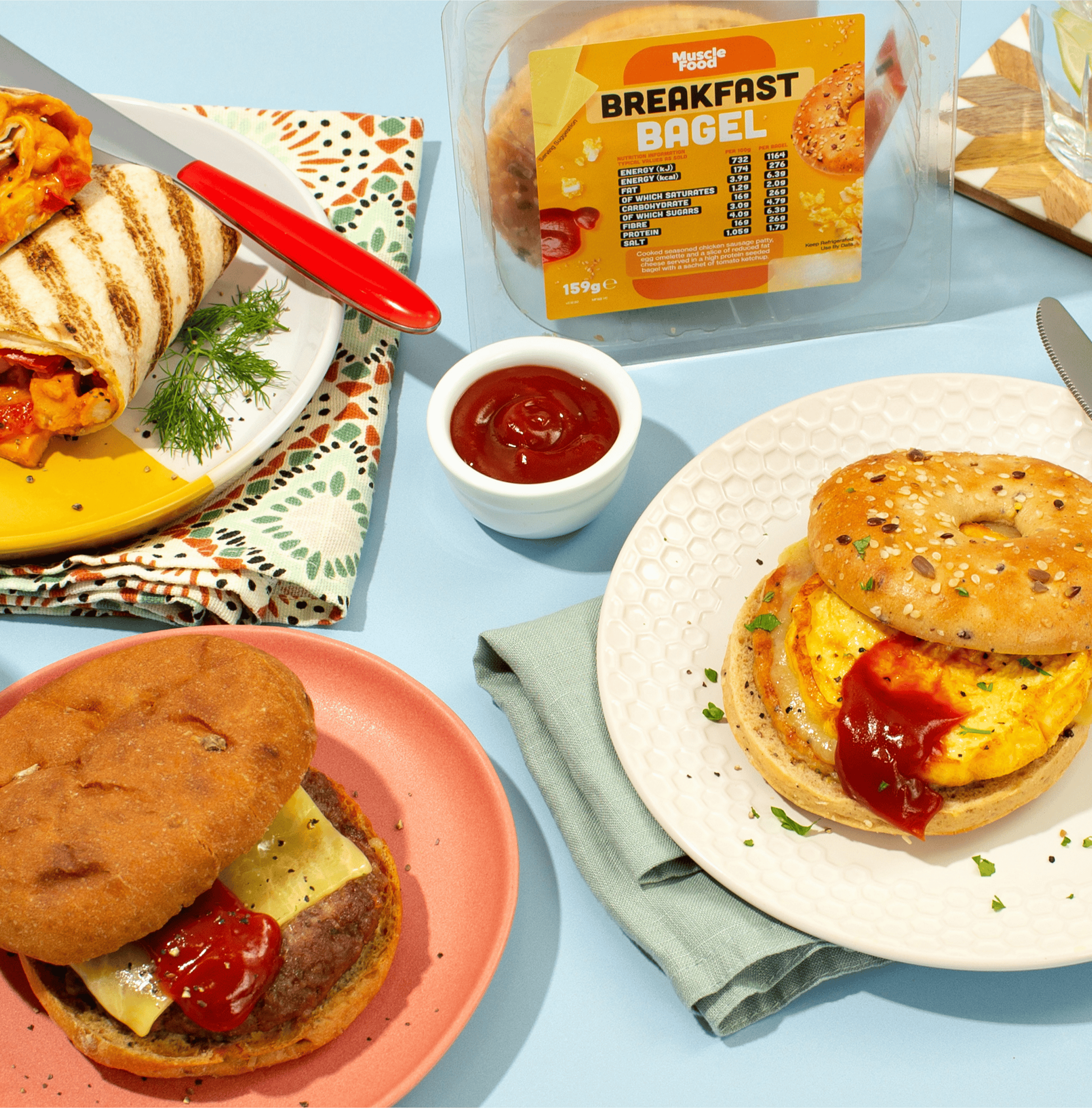
The breakfast bagel imagery pairs the pack with the prepared food. That relationship between product and meal runs through the work, connecting what someone buys with what they will eat.
I designed email marketing creative and animated promotional assets, using a clear offer hierarchy to connect the headline, product and next action. The envelope reveal adds a moment of anticipation before presenting the offer; the supporting loop shows another approach to movement within a campaign.
I built animated web banners for MuscleFood using Lottie and JavaScript, bringing design and code together in the browser. Lottie kept the animation crisp as the banner scaled. Try the original demo below and compare the wide and compact layouts.
Colour, meal photography and recipe names create a reading order that works across the Prepped Pots range.
Freezer graphics give the products a shared setting and carry the identity into the surrounding retail space.
Film, email loops and the coded banner each use movement to introduce food, reveal an offer or draw attention to a product benefit.
A consistent voice across social.
04 / Social media & campaign contentI created social media creative as part of the wider marketing mix, adapting product and promotional messages for the feed. Packaging, food imagery and campaign graphics supplied a shared visual language; the composition and pace changed to suit the placement.
The campaign film below shows the product-led motion side of this work. Email examples follow, showing how I developed a different treatment for an offer arriving in the inbox.