01
Find the symbol
Looked at the meaning of nest as shelter, meeting place, and a starting point for independent growth.
A warm identity for a children’s learning environment built around safety, independence, and the idea of a nest as both shelter and place to grow.
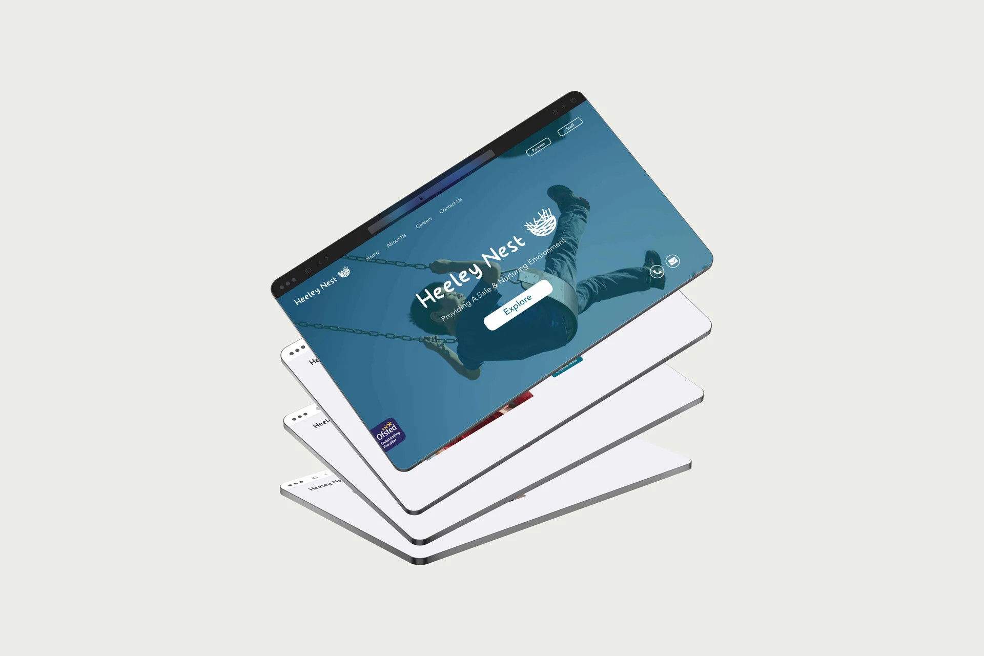
Heeley Nest needed a logo and identity that could communicate a safe, nurturing environment while giving children room to discover and learn independently.
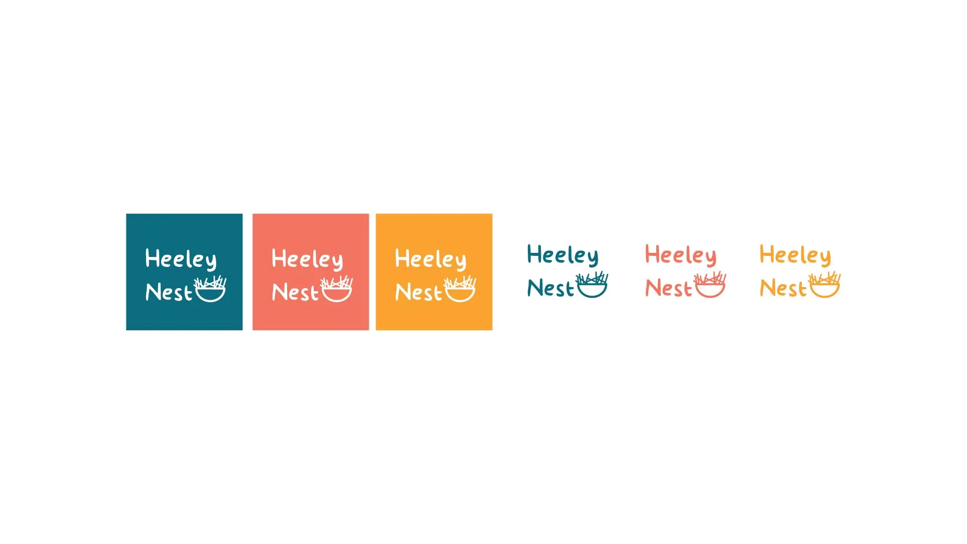
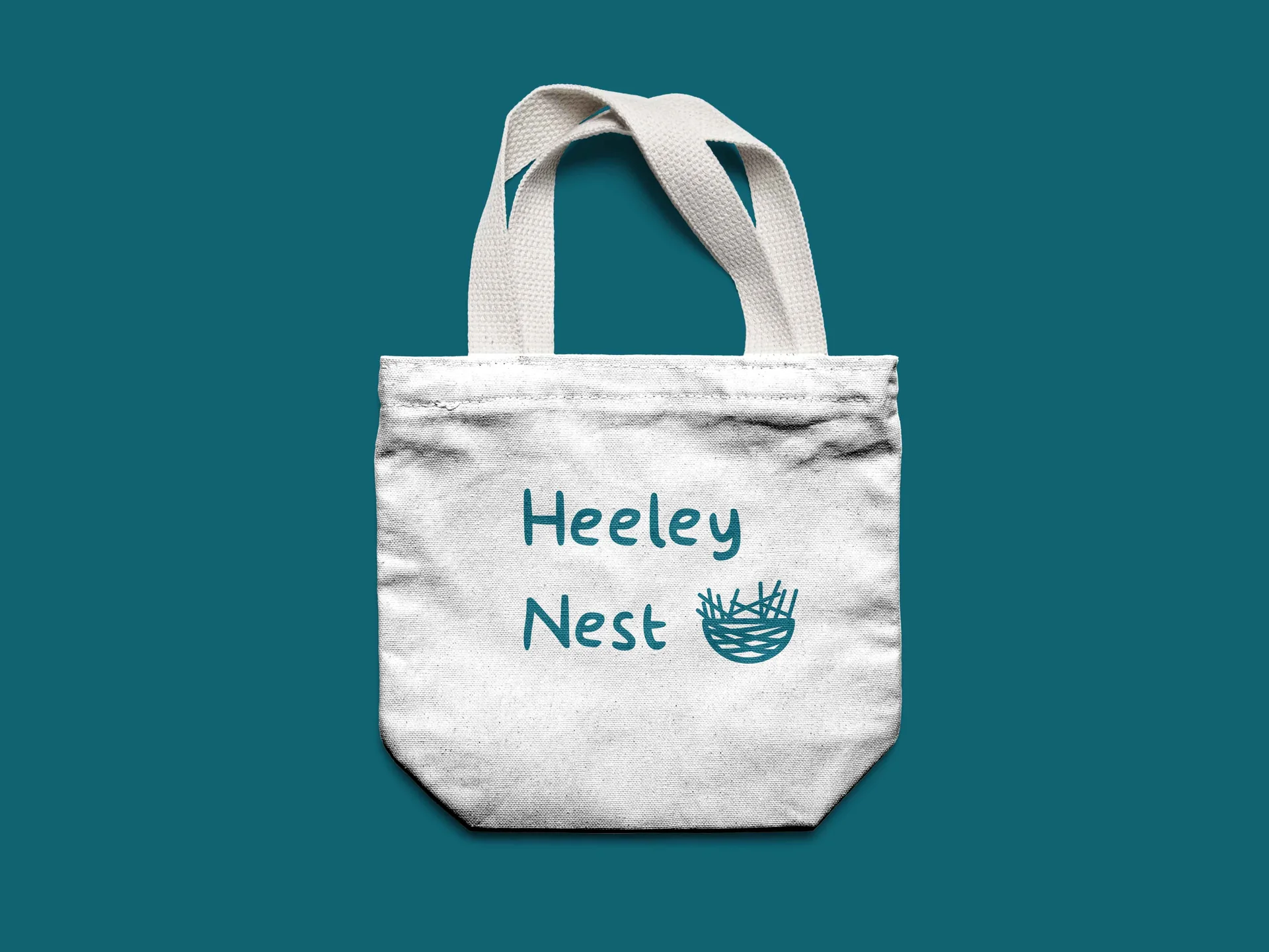
I designed the identity and explored its application across colour variations and printed objects. The logo treatments and tote mockup show how the same visual language carries across different uses.
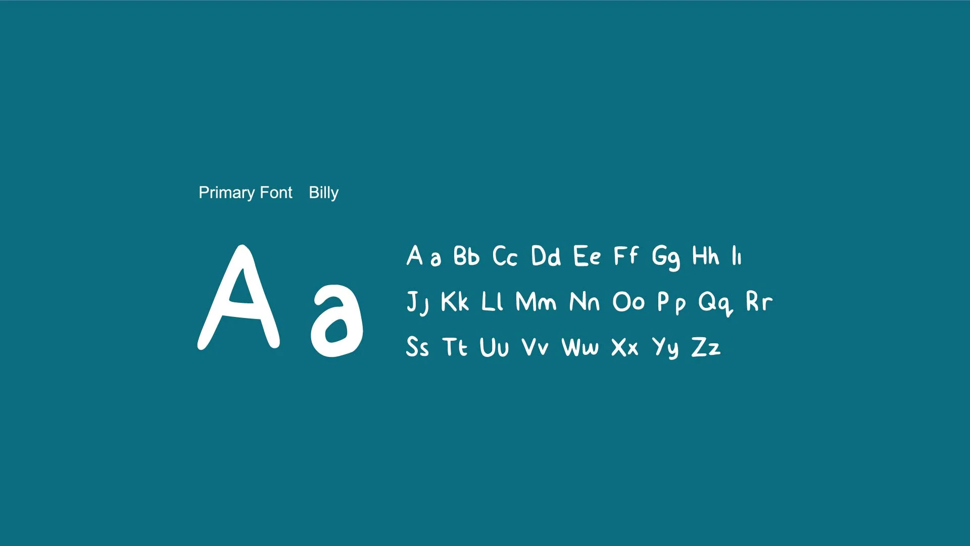
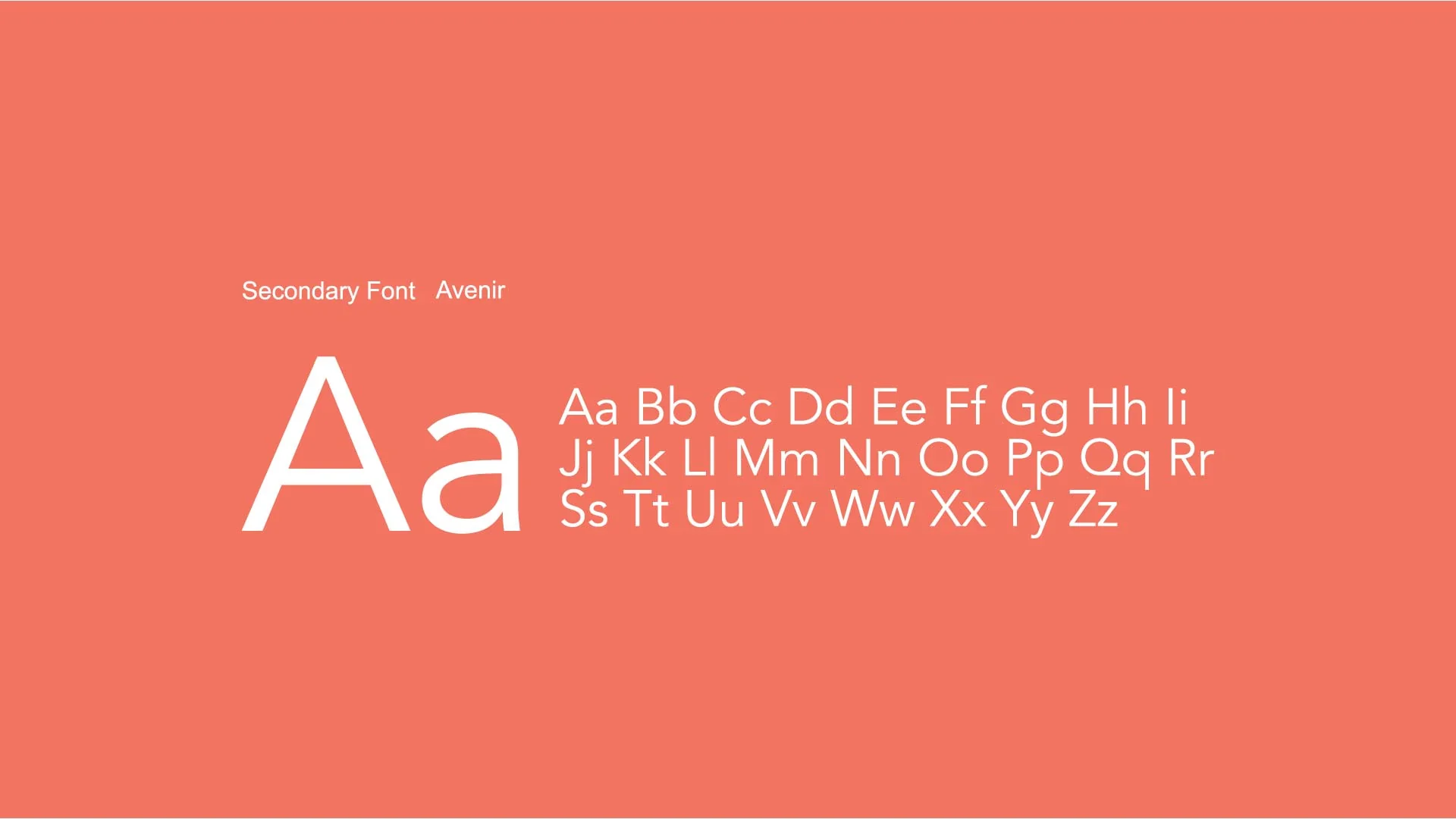
I selected primary and supporting typefaces as part of the brand guidelines, giving the identity a consistent hierarchy for headings and longer information.
Looked at the meaning of nest as shelter, meeting place, and a starting point for independent growth.
Developed a warm visual language that could feel reassuring without becoming overly precious.
Translated the identity into practical brand and print applications for the people using it every day.